Guideo
At a Glance
Problem
During my 5 weeks at Brainstation, our class was given the assignment to create a transit app. It was left up to us to find a transit problem, and solve it with the skills and digital tools learned in class. For this project we used the human centered design approach which included identifying problems in current user experiences by user interviews and testing our solutions by having users navigate rough sketches (using the Marvel app) and low fidelity wireframes (using Moqups).
Research
The first step in the process was finding out what the problem was in the first place! I interviewed 4 people, with this set of questions:
- What is your name?
- Where do you live? And work?
- Describe the last time you walked somewhere.
- What apps do you use to navigate?
- What makes you walk over using public transit?
- What do you wish you could change about the process of navigating somewhere?
- What information do you wish was readily available?
I then found some common issues that my interviewees shared:
- Transfers were a hassle due to delays and misinformation.
- Navigation apps would only provide a set of immutable routes. Users couldn't change parts of a route, so that they could walk halfway instead of using a streetcar.
- Detailed information such as a route being presto only or pricing information wasn't easily found.
- Uber was expensive, and Uber Pool didn't prioritize getting users there on time.
Surprisingly, none of my interviewees didn't mind walking 20 minutes if they didn't need to take another streetcar or bus.
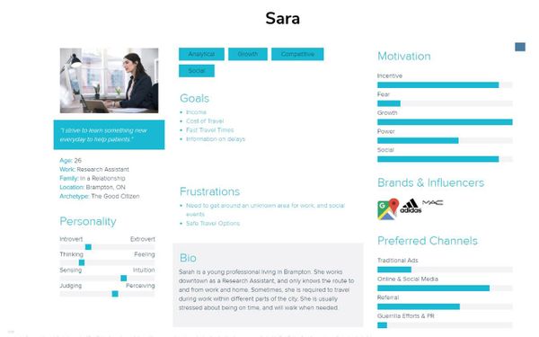
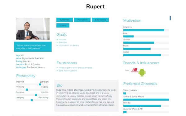
Personas
Using the information I gathered, I created two personas to embody the two user flows I was working towards.
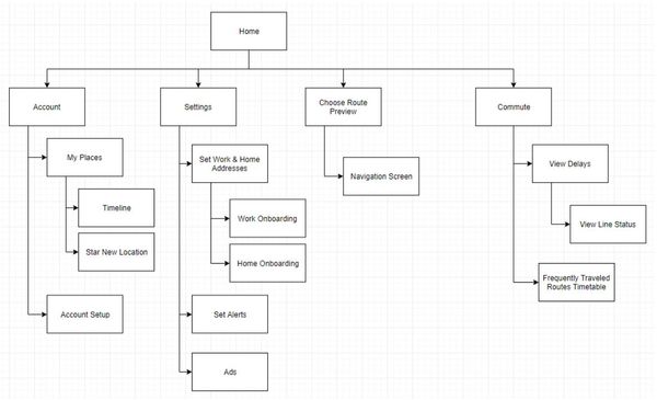
Information Architecture
I created an information architecture that a conventional navigational app would, but I kept it laser focused on one thing: making commute routes changeable at all times.
User Flows & Sketches
Waze and Google Maps were the main user interface inspiration. All of the users I interviewed were very familiar with them, and I wanted to use conventional, industry standard guidelines. Every second counts when trying to get somewhere, so recognition is key.
Original First User Flow & Sketch - Use bussing to get to work
I had run into a problem during the sketch mock-up testing of one of my initial user flows, and I had to rethink the purpose of this app. My initial hypothesis was that users would want to pick a way to go instead of picking where to go. This proved to be very confusing to my test users, as they weren't accustomed to not seeing a map and choosing a place. It also didn't really serve a purpose, as person really only chooses how they want to get there after seeing where it was.
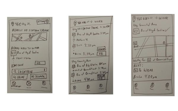
Some other interesting observations were that the "Go" button was confused with the Go Transit and users instinctively looked at the top of the screen to enter information.
I created two new user flows that reflected map and location first user flows, and during testing these seemed better received.
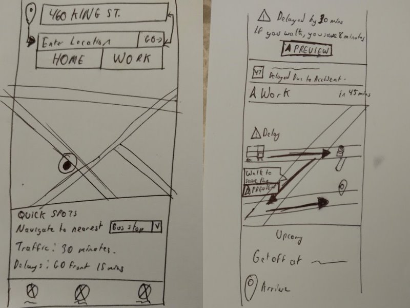
Version 2 First User Flow Sketch - Walk due to delays
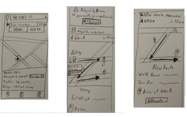
This new first flow is about a user is trying to find their way to work, and a delay comes up. They are be prompted to reroute and they follow the route. The revamped sketch included a full screen map, with a textbox at the top to type in the location.
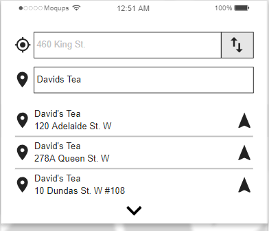
Second User Flow - Navigate to David's Tea
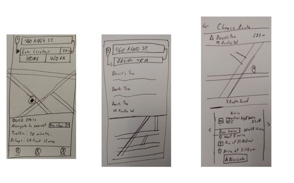
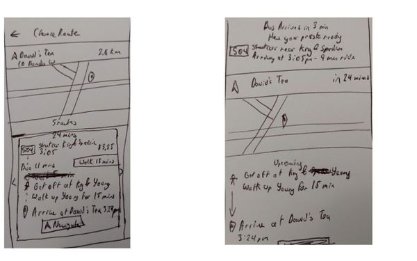
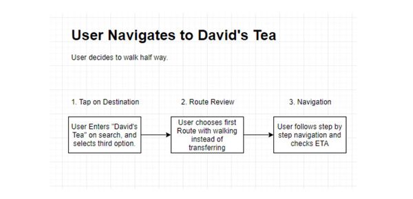
The second one is a user who wants to walk halfway instead of using public transit all the way. It's a spiritual successor to the original first sketch, in that it helps the user plan their route better.
Wireframe
The full wireframe has 2 interactive user flows.
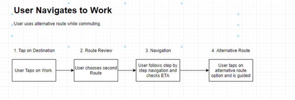
First User Flow Sketch - Walk due to delays
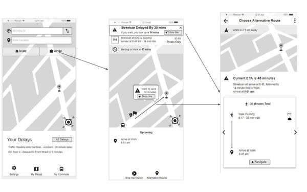
If you click on the Work button, you will follow the User Navigates to Work flow. This one demos how the app handles delays and re-routes.
Second User Flow - Navigate to David's Tea
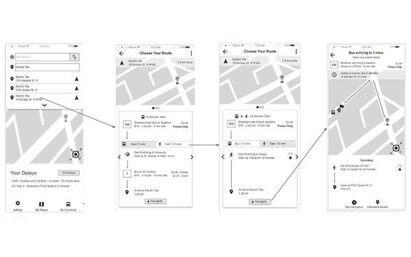
The User Navigates to David's Tea task flow can be started by clicking in the second textbox at the top, next to the location marker. This flow showcases how to modify routes.
End Result
Final Presentation
Project Deliverables
All of the following deliverables can be found in the presentation above.
- 4 User Interviews
- Information Architecture
- 2 Personas
- 2 User Flows & Sets of Sketches
- Wireframe
The differentiating factors of Guideo were three things:
- A faster way to identify alternative routes, and modify specific parts of a route with walking.
- Pricing information is readily available, and it notifies if a route is presto only.
- It will notify and provide alternative walking routes when there is a delay.
I came away from the course with a greater understand of how to produce a better user experience. I learned how to throw away my ego when being critiqued. How to stay silent and provide not provide answers during user testing. When and how to prod for knowledge the interviewee thought was common sense.
Industry professionals Gerard Dolan and David Aboutboul taught our class invaluable life and career lessons. I hope to carry a design thinking approach to everything that I do henceforth.